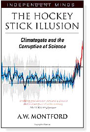
Andrew Montford’s The Hockey Stick Illusion is one of the best science books in years. It exposes in delicious detail, datum by datum, how a great scientific mistake of immense political weight was perpetrated, defended and camouflaged by a scientific establishment that should now be red with shame. It is a book about principal components, data mining and confidence intervals—subjects that have never before been made thrilling. It is the biography of a graph.
I can remember when I first paid attention to the “hockey stick” graph at a conference in Cambridge. The temperature line trundled along with little change for centuries, then shot through the roof in the 20th century, like the blade of an ice-hockey stick. I had become somewhat of a skeptic about the science of climate change, but here was emphatic proof that the world was much warmer today; and warming much faster than at any time in a thousand years. I resolved to shed my doubts. I assumed that since it had been published in Nature—the Canterbury Cathedral of scientific literature—it was true.
I was not the only one who was impressed. The graph appeared six times in the Intergovernmental Panel on Climate Change (IPCC)’s third report in 2001. It was on display as a backdrop at the press conference to launch that report. James Lovelock pinned it to his wall. Al Gore used it in his film (though describing it as something else and with the Y axis upside down). Its author shot to scientific stardom. “It is hard to overestimate how influential this study has been,” said the BBC. The hockey stick is to global warming what St. Paul was to Christianity.
Of course, there is other evidence for global warming, but none of it proves that the recent warming is unprecedented. Indeed, quite the reverse: surface temperatures, sea levels, tree lines, glacier retreats, summer sea ice extent in the Arctic, early spring flowers, bird migration, droughts, floods, storms—they all show change that is no different in speed or magnitude from other periods, like 1910–1940, at least as far as can be measured. There may be something unprecedented going on in temperature, but the only piece of empirical evidence that actually says so—yes, the only one—is the hockey stick.
And the hockey stick is wrong. The emails that were leaked from the University of East Anglia late last year are not proof of this; they are merely the icing on the cake, proof that some of the sci- entists closest to the hockey stick knew all along that it was problematic. Andrew Montford’s book, despite its subtitle, is not about the emails, which are tagged on as a last chapter. It is instead built around the long, lonely struggle of one man—Stephen McIntyre—to understand how the hockey stick was made, with what data and what programs.
A retired mining entrepreneur with a mathematical bent, McIntyre asked the senior author of the hockey stick graph, Michael Mann, for the data and the programs in 2003, so he could check it himself. This was five years after the graph had been published, but Mann had never been asked for them before. McIntyre quickly found errors: mislocated series, infilled gaps, truncated records, old data extrapolated forwards where new was available, and so on.
Not all the data showed a 20th century uptick either. In fact just 20 series out of 159 did, and these were nearly all based on tree rings. In some cases, the same tree ring sets had been used in different series. In the end, the entire graph got its shape from a few bristlecone and foxtail pines in the western United States; a messy tree-ring data set from the Gaspé Peninsula in Canada; another Canadian set that had been truncated 17 years too early called, splendidly, Twisted Tree Heartrot Hill; and a superseded series from Siberian larch trees. There were problems with all these series: for example, the bristlecone pines were probably growing faster in the 20th century because of more carbon dioxide in the air, or recovery after “strip bark” damage, not because of temperature change.
This was bad enough; worse was to come. Mann soon stopped cooperating, yet, after a long struggle, McIntyre found out enough about Mann’s programs to work out what he had done. The result was shocking. He had standardized the data by “short-centering” them—essentially subtracting them from a 20th century average rather than an average of the whole period. This meant that the principal component analysis “mined” the data for anything with a 20th century uptick, and gave it vastly more weight than data indicating, say, a medieval warm spell.
Well, it happens. People make mistakes in science. Corrections get made. That’s how it works, is it not? Few papers get such scrutiny as this had. But that is an even more worrying thought: How much dodgy science is being published without the benefit of an audit by Mcintyre’s ilk? As a long-time champion of science, I find the reaction of the scientific establishment more shocking than anything. The reaction was not even a shrug: It was shut-eyed denial.
If this had been a drug trial done by a pharmaceutical company, the scientific journals, the learned academies and the press would have soon have rushed to discredit it—and rightly so. Instead, they did not want to know. Nature magazine, which had published the original study, went out of its way to close its ears to McIntyre’s criticisms, even though they were upheld by the reviewers it appointed. So did the National Academy of Sciences in the United States, even when two reports commissioned by Congress upheld McIntyre. So, of course, did the IPCC, which tied itself in knots changing its deadlines so it could include flawed references to refutations of McIntyre while ignoring complaints that it had misquoted him.
The IPCC has taken refuge in saying that other recent studies confirm the hockey stick but, if you take those studies apart, the same old bad data sets keep popping out: bristlecone pines and all. A new Siberian data series from a place called Yamal showed a lovely hockey stick but, after ten years of asking, McIntyre finally got hold of the data last autumn and found that it relied heavily on just one of just twelve trees, when far larger samples from the same area were available showing no uptick. Another series from Finnish lake sediments also showed a gorgeous hockey stick, but only if used upside down. McIntyre just keeps on exposing scandal after scandal in the way these data were analysed and presented.
Montford’s book is written with grace and flair. Like all the best science writers, he knows that the secret is not to leave out the details (because this just results in platitudes and leaps of faith), but rather to make the details delicious, even to the most unmathematical reader. I never thought I would find myself unable to put a book down because—sad, but true—I wanted to know what happened next in an r-squared calculation. This book deserves to win prizes.
Oh, and by the way, I have a financial interest in coal mining, though not as big as Al Gore has in carbon trading. Maybe you think it makes me biased. Read the book and judge for yourself.
The Hockey Stick Illusion is published by Stacey International, 482 pages, list price $18.00.
Reprinted with permission from Matt Ridley and Prospect magazine.


